
How to Match Carpet and Furniture: 10 Color Combinations
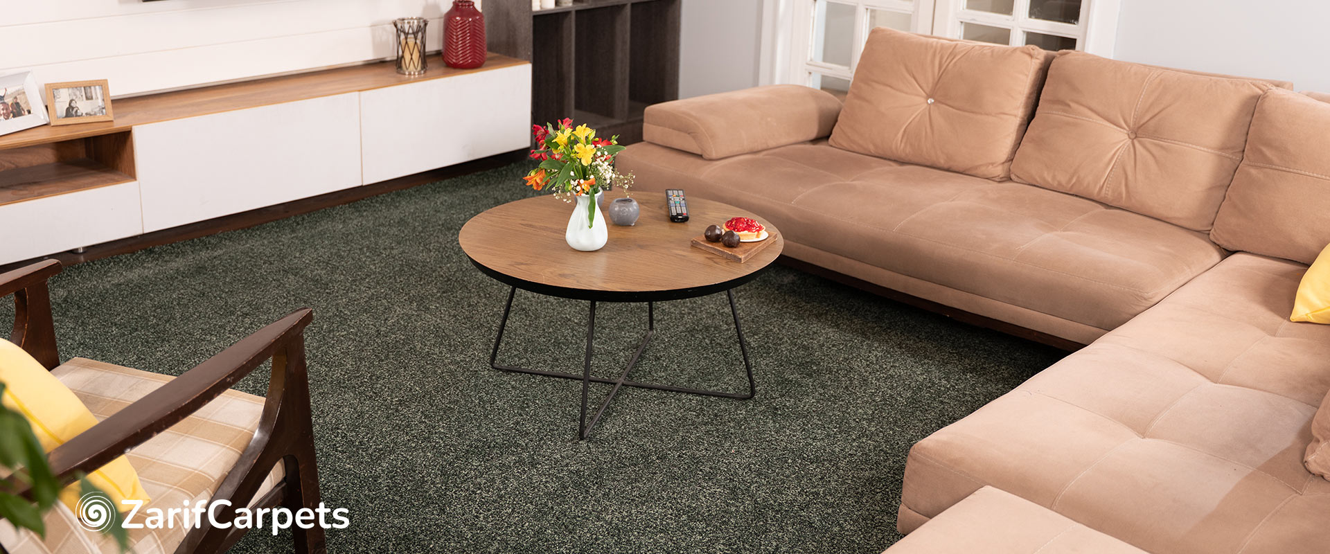
Choosing carpet and furniture together can completely change the character of an interior.
A sofa may look perfect in a showroom, and a carpet may look beautiful in a sample book, but placing the two together can produce a very different result. One may appear warmer than expected. A neutral sofa can suddenly look too cool. A patterned carpet can compete with furniture that seemed simple on its own. Even two colors that appear compatible on a screen may clash when they occupy large areas of the same room.
This is why successful interiors are rarely built around one color at a time.
The goal is not to make the carpet and furniture identical. The goal is to create a relationship between them through color, undertone, contrast, proportion, texture, and pattern.
For homeowners, interior designers, architects, and flooring professionals, this approach becomes particularly important because carpet often represents one of the largest visual surfaces in a residential interior.
This guide explores how to match carpet and furniture and examines ten practical color combinations that can be adapted to different interior styles.
Why Carpet and Furniture Need to Be Considered Together
Furniture and flooring have different visual roles.
Furniture often acts as the focal point of the room, while carpet creates the background that connects the major pieces together.
However, because carpet covers such a large area, it can also become a dominant visual element.
This creates three basic possibilities:
- The carpet supports the furniture.
- The carpet competes with the furniture.
- The carpet and furniture create a balanced visual hierarchy.
The third option is usually the most successful.
A balanced room does not require every element to be the same color. In fact, using identical colors can make the interior feel flat.
Instead, designers often work with different levels of contrast.
For example:
Cream sofa + warm beige carpet + dark wood
creates more depth than:
Beige sofa + beige carpet + beige walls
even though both interiors use similar color families.
The difference comes from contrast and hierarchy.
The Five Elements Behind Successful Carpet and Furniture Combinations
Before looking at specific combinations, it helps to understand the five factors that determine whether two elements work together.
1. Hue
Hue refers to the basic color family: grey, beige, green, blue, brown, and so on.
2. Undertone
Two colors can belong to the same general family but still feel very different.
A blue-grey and a warm grey may both be described as “grey,” but their undertones create different relationships with furniture and walls.
3. Value
Value refers broadly to how light or dark a color appears.
A dark sofa with a very dark carpet creates a completely different visual effect from a dark sofa on a light carpet.
4. Saturation
Highly saturated furniture requires different flooring support from muted furniture.
A bright green sofa, for example, may need a much quieter carpet than a muted olive sofa.
5. Texture
Color does not exist independently from material.
A soft, textured carpet can make a neutral palette feel richer, while a flat carpet may create a cleaner appearance.
A Simple Rule: Do Not Match Everything Exactly
One of the most common mistakes in residential interiors is trying to make the carpet, sofa, curtains, and walls all match exactly.
Exact matching can remove visual hierarchy.
Instead, try to create a relationship through one of these approaches:
Tonal harmony
Use several shades from the same color family.
Contrast
Pair a light carpet with darker furniture or vice versa.
Complementary colors
Use colors that sit in visually compatible relationships.
Temperature balance
Combine warm and cool tones carefully.
Texture contrast
Keep the colors relatively similar but introduce different textures.
This gives designers far more flexibility.
10 Carpet and Furniture Color Combinations
The following combinations cover some of the most versatile approaches for residential carpet flooring.
1. Warm Beige Carpet + Cream Sofa
Few combinations create as much visual warmth with so little effort as warm beige and cream.
The combination works because both colors are related, but they are not identical.
The beige carpet establishes the foundation, while the cream sofa remains visually distinct.
Why It Works
Warm beige can connect naturally with:
- Oak furniture
- Walnut wood
- Linen
- Brass
- Natural stone
- Warm white walls
The cream sofa then becomes part of the same visual family.
Where It Works Best
This combination is particularly effective in:
- Living rooms
- Guest rooms
- Bedrooms
- Transitional interiors
- Scandinavian-inspired interiors
- Warm minimalist spaces
How to Add Contrast
If the room becomes too pale, introduce darker accents rather than changing the carpet.
For example:
Warm beige carpet + cream sofa + walnut table + dark green cushions
creates a much stronger visual hierarchy.
Recommended design direction
Keep the main colors soft and introduce contrast through furniture legs, artwork, plants, lighting fixtures, or accessories.
2. Taupe Carpet + Grey Sofa
Taupe and grey are extremely useful for contemporary residential interiors.
The challenge with grey alone is that some shades can make a room feel cold.
Taupe introduces warmth while maintaining the modern character of grey.
Why It Works
Taupe sits between several neutral families.
This makes it useful when the room contains both warm and cool materials.
For example:
Grey sofa + taupe carpet + oak floor elements + off-white walls
can create a sophisticated but comfortable interior.
Choosing the Right Grey
The sofa’s undertone matters.
A blue-grey sofa works best with a cooler taupe or greige.
A warm grey sofa can work beautifully with a more brown-based taupe.
The principle is simple:
The warmer the sofa, the warmer the supporting neutral can be.
Best Applications
This combination is suitable for:
- Contemporary living rooms
- Apartments
- Open-plan interiors
- Home offices
- Boutique hospitality-inspired residences
3. Light Grey Carpet + White Furniture
This combination is ideal when the goal is brightness and visual simplicity.
Light grey provides enough contrast to separate white furniture from the floor without creating a dramatic transition.
Why It Works in Bright Interiors
White furniture can sometimes disappear against a very pale floor.
A soft grey carpet creates definition while preserving the bright character of the room.
This makes it particularly useful for interiors with:
- Large windows
- Minimalist furniture
- White walls
- Black accents
- Contemporary lighting
Avoiding a Cold Appearance
If the room begins to feel too cool, add warm materials.
Wood, wool, natural linen, warm lighting, and earthy accessories can soften the palette.
This illustrates an important principle in carpet flooring design:
A neutral color palette still needs temperature balance.
4. Sand Carpet + Natural Wood Furniture
For interiors inspired by nature, sand-colored carpet and natural wood are among the easiest combinations to coordinate.
Sand tones provide a soft neutral background while allowing the wood grain to remain visible.
Materials That Work Well with This Palette
- Oak
- Ash
- Rattan
- Linen
- Cotton
- Stone
- Leather
- Natural ceramics
This combination is especially suitable for interiors where the goal is to create a calm and organic atmosphere.
Where It Works
Consider it for:
- Bedrooms
- Living rooms
- Vacation homes
- Hospitality-inspired residences
- Japan Di interiors
- Scandinavian interiors
Pattern or Plain Carpet?
A completely plain sand carpet creates a minimal appearance.
A subtly textured or tone-on-tone carpet can create more depth while maintaining the same natural aesthetic.
This is a useful example of how carpet design can become richer without introducing additional colors.
5. Charcoal Carpet + Light Sofa
Dark carpet can create a strong visual foundation.
When paired with light furniture, it produces contrast and anchors the room.
For example:
Charcoal carpet + cream sofa + light oak furniture
creates a dramatic but balanced interior.
Why Contrast Works
A dark floor visually grounds the room.
The lighter furniture then becomes the focal point.
This is particularly effective in larger rooms where a very light floor might otherwise make the space feel visually empty.
What to Watch Out For
Dark carpet can make:
- Dust more noticeable
- Light-colored lint more visible
- Small rooms feel more intimate
- Strong furniture colors appear even stronger
This does not make dark carpet impractical.
It simply means the color should be considered together with lighting, maintenance, and room size.
6. Neutral Carpet + Navy Furniture
Navy is visually strong, but it remains relatively versatile because it combines well with many neutral families.
A neutral carpet allows navy furniture to become the focal point without creating visual competition.
Effective Neutral Options
Consider:
- Soft beige
- Warm grey
- Taupe
- Cream
- Greige
- Sand
The correct choice depends on whether the room is warm or cool overall.
For a Classic Interior
Try:
Warm beige carpet + navy sofa + walnut furniture + brass lighting
For a Contemporary Interior
Try:
Light greige carpet + navy sofa + white walls + black accents
The same furniture color can therefore support very different interior styles depending on the carpet.
7. Warm Grey Carpet + Green Furniture
Green is increasingly useful in residential interiors because it connects naturally with plants and natural materials.
However, not every green has the same visual effect.
Deep forest green, olive, sage, and muted green each require slightly different support.
Sage Green + Warm Grey
This combination can create a calm and contemporary atmosphere.
Olive + Taupe
Olive often works beautifully with warmer neutrals.
Forest Green + Cream
A darker green can become an elegant focal point when paired with a lighter neutral carpet.
The carpet should generally remain quieter when the furniture color is strong.
This is particularly important in living room carpet flooring, where the carpet may occupy more area than the sofa.
8. Patterned Carpet + Plain Furniture
Sometimes the carpet should be the focal point.
A patterned carpet can introduce personality into an otherwise restrained room.
This works especially well when furniture is simple.
For example:
Geometric patterned carpet + plain cream sofa + black side table
creates visual interest without creating chaos.
Pattern Scale Matters
A large pattern has a stronger visual impact.
A small-scale pattern acts more like texture.
Large pattern
Best when:
- Furniture is restrained
- The room is spacious
- The architecture is simple
Small pattern
Best when:
- The room is compact
- Several decorative elements already exist
- A subtle design effect is preferred
Pattern and Maintenance
Pattern can also influence how everyday variation appears.
A multi-tone pattern may be less visually sensitive to minor marks than a perfectly uniform surface.
9. Plain Carpet + Patterned Furniture
The opposite strategy can be equally effective.
If the sofa, curtains, cushions, or artwork already contain strong patterns, introducing another dominant pattern on the floor may create visual overload.
A plain or lightly textured carpet can provide visual breathing room.
For example:
Patterned sofa + solid taupe carpet + textured curtains
can feel much more balanced than:
Patterned sofa + patterned carpet + patterned curtains
The principle is not that patterned furniture requires plain flooring in every situation.
It is that visual complexity should be distributed intentionally.
- 10. Monochrome Furniture + Textured Carpet
Monochrome interiors can sometimes feel flat.
Black, white, and grey create a sophisticated palette, but without texture, the result may lack depth.
This is where textured carpet becomes particularly effective.
For example:
White sofa + black table + charcoal accessories + textured grey carpet
can create a strong contemporary interior.
The colors remain restrained, but the carpet introduces depth through its surface.
This is an excellent example of using texture instead of additional color.
Understanding Light and Dark Contrast
The relationship between furniture and carpet is strongly influenced by value.
A useful starting point is to consider whether you want:
High contrast
Light carpet + dark furniture
or
Dark carpet + light furniture
This creates a strong visual relationship.
Medium contrast
Mid-tone carpet + slightly lighter or darker furniture
This feels more understated.
Low contrast
Similar carpet and furniture tones
This creates visual continuity.
None of these approaches is inherently better.
The choice should reflect the atmosphere of the room.
How Room Size Changes Carpet and Furniture Combinations
The same combination can behave very differently in different room sizes.
Small rooms
Strong contrast can sometimes make individual elements appear more separate.
A coordinated palette with moderate contrast can create greater continuity.
Large rooms
More contrast can help define the space.
For example, a dark sofa on a light carpet can establish a clear seating zone.
Open-plan interiors
Carpet can be used strategically to define the living area.
For example:
Open-plan kitchen + dining + living
can use one flooring palette throughout while a patterned carpet visually defines the living zone.
This approach allows carpet to contribute to spatial organization.
Matching Carpet with Wood Furniture
Wood is one of the most common materials used alongside residential carpet.
The key is to understand the wood tone.
Light wood
Works naturally with:
- Cream
- Sand
- Light beige
- Soft grey
- Greige
Medium warm wood
Works well with:
- Taupe
- Beige
- Warm grey
- Olive accents
Dark wood
Can create strong contrast with:
- Cream
- Light grey
- Sand
- Beige
The safest approach is not necessarily to match the carpet to the wood exactly.
Instead, use carpet to either reinforce the warmth of the wood or create controlled contrast.
Matching Carpet with Leather Furniture
Leather furniture introduces another important consideration: texture.
Leather already has a strong material identity.
A completely flat carpet can sometimes make the interior feel visually rigid.
A softly textured carpet can provide contrast.
Brown leather
Works well with:
- Beige
- Sand
- Taupe
- Warm grey
Black leather
Works well with:
- Light grey
- Cream
- Greige
- Mid-tone neutrals
Cognac leather
Pairs naturally with:
- Beige
- Sand
- Warm grey
- Olive
- Cream
Here, texture becomes as important as color.
Matching Carpet with White Walls
White walls are highly flexible, but not all whites are the same.
Warm white walls support:
- Beige
- Cream
- Sand
- Taupe
- Warm grey
Cool white walls may work better with:
- Soft grey
- Greige
- Cool stone
- Blue-grey
A useful rule is to compare the wall’s undertone with the carpet’s undertone before choosing.
Matching Carpet with Curtains and Soft Furnishings
Curtains, cushions, rugs, and upholstery can create a secondary color system.
Rather than making the carpet identical to these elements, look for a common visual thread.
For example:
Taupe carpet + cream sofa + sage curtains
works because all three colors are relatively muted and compatible.
Another approach is to repeat one accent color subtly.
For example:
Light grey carpet + white sofa + navy cushions + navy artwork
creates continuity without turning the entire room navy.
A Useful 60–30–10 Approach
One practical method for interior color balance is the 60–30–10 concept.
It can be adapted for carpet and furniture.
60% — Dominant color
Walls or major flooring/furniture surface.
30% — Secondary color
Sofa, curtains, cabinetry, or carpet depending on the room.
10% — Accent color
Cushions, artwork, accessories, or small furniture.
For example:
60% warm off-white walls + 30% taupe carpet and sofa + 10% deep green accents
creates a balanced palette.
This is not a strict mathematical formula.
It is a visual planning tool.
Carpet and Furniture: A Comparison Matrix
For quick project decisions, the following table can be useful.
Furniture Style / Color | Recommended Carpet Direction | Design Effect |
Cream sofa | Beige / taupe / sand | Warm and calm |
Grey sofa | Taupe / greige / soft grey | Modern and balanced |
Navy sofa | Neutral beige / greige | Strong focal point |
Green sofa | Warm grey / taupe | Natural and sophisticated |
Black sofa | Light grey / cream | High contrast |
Brown leather | Beige / sand / taupe | Warm and classic |
White furniture | Soft grey / greige | Clean and contemporary |
Patterned sofa | Plain or subtly textured | Controlled and balanced |
Minimalist furniture | Textured or patterned carpet | Adds depth |
Dark wood | Light neutral carpet | Contrast and warmth |
When Should Carpet Become the Focal Point?
There are interiors where the floor should attract attention.
This can be particularly effective when:
- Furniture is minimal
- Walls are restrained
- Lighting is simple
- The room is large
- The architecture provides a neutral canvas
In such spaces, a distinctive carpet pattern can establish identity.
However, if the room already contains a dramatic chandelier, statement sofa, elaborate wall treatment, and colorful artwork, a highly expressive carpet may be too much.
The floor should participate in the hierarchy, not compete with every element simultaneously.
When Should the Carpet Stay Quiet?
A restrained carpet is usually appropriate when other elements are dominant.
For example, consider a living room with:
- Large patterned sofa
- Statement artwork
- Decorative curtains
- Sculptural lighting
- Strong architectural details
In this case, the carpet may work best as a neutral background.
Soft beige, taupe, greige, or textured grey can create the necessary visual balance.
Common Mistakes When Matching Carpet and Furniture
Mistake 1: Exact matching
Trying to find a carpet that exactly matches the sofa can make the room feel flat.
Mistake 2: Ignoring undertones
Two neutrals can clash even though both are technically “neutral.”
Mistake 3: Too many patterns
Multiple competing patterns can make the room visually busy.
Mistake 4: Forgetting texture
Color alone cannot create a sophisticated interior.
Mistake 5: Choosing for the showroom
A carpet can look very different in the actual room.
Mistake 6: Ignoring room size
A dramatic carpet that works in a large space may overwhelm a compact room.
Mistake 7: Ignoring maintenance
Very light or very dark carpet colors can have different visual maintenance requirements.
Mistake 8: Treating every room identically
The best carpet combination for a formal living room may not be ideal for a children’s room or bedroom.
How to Test a Carpet and Furniture Combination Before Installation
A good way to reduce mistakes is to create a visual sample board.
Include:
- Carpet sample
- Sofa fabric
- Curtain fabric
- Wall paint sample
- Wood finish
- Metal finish
- Large decorative element
Then review the materials under both natural and artificial light.
For larger projects, an even better approach is to place a larger carpet sample directly in the room.
This allows the design team to evaluate:
- Scale
- Light reflection
- Color temperature
- Pattern repetition
- Texture
- Relationship with furniture
This is especially important for large areas of residential carpet because a small sample may not communicate the complete visual effect.
How to Choose Between Similar Neutral Carpets
Suppose three carpets appear almost identical:
- Warm grey
- Greige
- Taupe
How do you choose?
Start with the room.
If the room contains warm wood and cream:
Taupe may be the strongest direction.
If the room combines warm and cool materials:
Greige may provide the best bridge.
If the room is strongly contemporary:
A soft grey may provide the cleanest result.
The difference may seem subtle in a sample book, but it can become significant across a complete floor.
Final Thoughts: The Goal Is Harmony, Not Matching
Matching carpet and furniture are not about finding identical colors.
It is about creating relationships.
The most successful combinations usually balance:
color + undertone + contrast + texture + proportion + light
A cream sofa does not need a cream carpet.
A grey sofa does not require grey flooring.
A patterned carpet does not require patterned furniture.
Instead, think about what role each element should play.
Should the carpet disappear into the background?
Should it define the room?
Should it create contrast?
Should it add texture?
Should it connect warm and cool materials?
Once these questions are answered, choosing the right color combination becomes much easier.
For residential interiors, carpet is more than a surface beneath the furniture. It is one of the largest visual elements in the room and can influence the atmosphere, comfort, and identity of the entire space.
The best carpet and furniture color combinations are therefore not those that match most closely.
They are the combinations that make the whole room feel intentional.
